Designing a user-friendly e-commerce navigation UX can be difficult. It needs a simplistic taxonomy, mobile-friendly buttons, and carefully chosen links. This guide will teach you how to enhance your eCommerce navigation UX with 6 best practices.
Why Is Your Website Navigation UX Important?
When it comes to designing an eCommerce website, a lot of us focus so much on the look and functionality of our creations that we often forget about the end-user experience. But UX matters to both your customers and your SEO.
Bad UX can affect how well users can find your content and how well they convert. It can cause high bounce rates that not only impact your website traffic but also how search engines rank your pages. So your eCommerce navigation UX can negatively affect your ranking, your traffic, and your conversion.
6 Best Practices for Ecommerce Navigation UX
Customers don’t want to have to fight to navigate your homepage and so making their customer journey more difficult by using hidden menus or overly fancy graphics, will ultimately mean that your bounce rate will increase and sales will decrease.
These 6 best practices will help you to avoid the common pitfalls of eCommerce navigation UX.
1. Use Widely Accepted Symbols
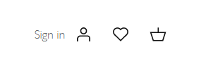
Symbols are used all over the internet. They are everywhere, from your local Facebook selling pages, all the way up to your Amazon account. But they are more than just a stylish design.
Using symbols is a way to deliver information quickly and without using many pixels. Think about the shopping cart icon as the perfect example. Replacing the words with symbols means that the customer doesn’t have to spend any additional time trying to work out what they’re being asked to do and gives them an easy pathway to find the page or information they are looking for.
However, how effective the symbols are in helping the customer navigate your site depends on what symbols are used. It can sometimes cause an issue if an unfamiliar symbol is used, whether that is for design or branding purposes. Consider the familiar shopping cart icon. If a website decided to use a currency symbol instead of a cart for stylistic reasons, customers may not understand what this button does. They may see the currency symbol and think that this will direct them to the page which will advise them of the types of ways that they can pay. So using standard symbols is key for your eCommerce website’s navigation.
There are three types of symbols:
Universal – Everyone recognizes and understands this icon or symbol
Multi-Use – Most people recognize this icon or symbol, but it has multiple possible meanings
Unknown – Few people neither recognize nor understand this icon or symbol
As an eCommerce website, Universal symbols are the safest and most likely to support your customer in navigating your website.
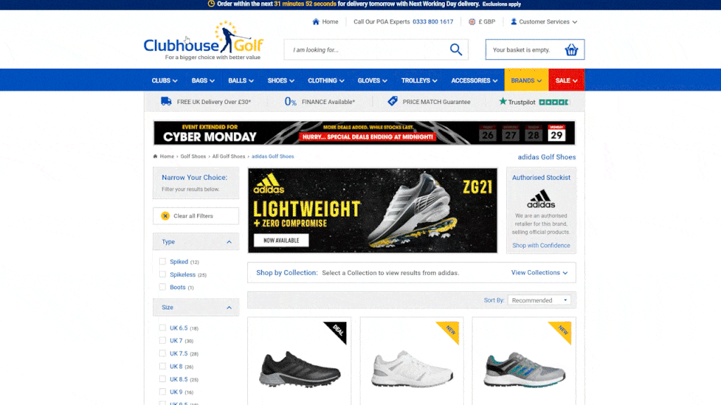
2. Place Main Navigation In A Sensible Location
Another design choice that most businesses make for style reasons more than UX is the location of the main menu or navigation. All websites should have obvious navigation, whether that is desktop or mobile, but did you know that whether you have your navigation menu at the top, side, or bottom of the screen matters?
Think about the top 10 eCommerce websites that you use to shop. Where are their navigation menus? Most, if not all of them have their menu in one of two places:

Top – The most common place for navigation menus to appear is in the header, underneath the logo but above all page content.
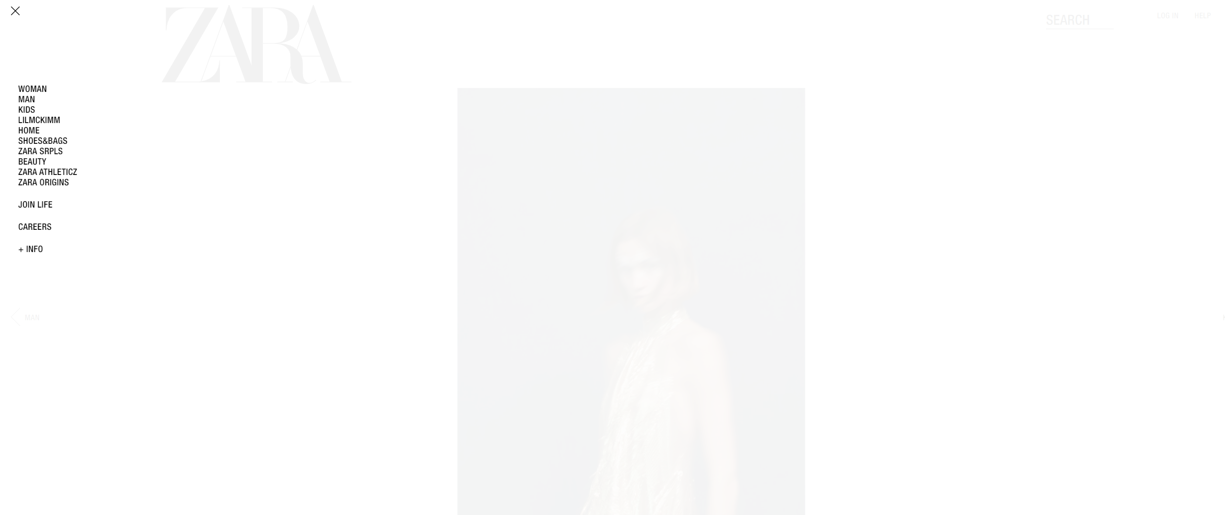
Left Side – More common on mobile layouts, a left sidebar remains visible while users browse the content on each page.
Adding your main navigation either horizontally at the top of the page or vertically down the left-hand side of the page will mean that your website will follow the same sort of structure as other well known and well-converting websites which will allow customers to navigate through your website in a way that they are familiar and comfortable with. Making users search in unfamiliar locations for your main navigation could confuse users and lead to increased bounce rate and reduced ability for search engines to crawl your site.
3. Ensure That Your Navigation Bar Is Fixed
As part of making sure that users know where to find your navigation menu you should also keep it visible at all times. That means having a fixed navigation bar that remains on the screen even if your customer scrolls down the page. This ensures that the content is accessible no matter what the user has decided to click on or what page they are viewing. It can also help the user use your site making accessing pages much quicker and reducing the amount of clicks needs to find certain pages.
However, actually implementing a fixed navigation menu on your website can be difficult from both technical and design aspects. Often, navigation menus can appear bulky and intrusive, which leads most designers will opt to keep them at the top of each page only. However, the UX benefits of having a constant menu on-screen outweigh the negative elements of implementation.
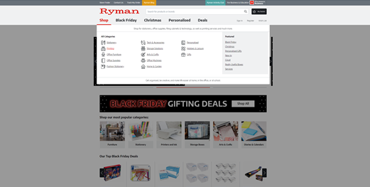
4. Limit The Number Of Menu Items

One way to balance the design and functional elements of a fixed navigation menu is to make your menu less obtrusive. You can do this by being careful with the amount of items in your menu.
Although most businesses will automatically think that having as much of their content available as possible to their customers in the menu is the right thing to do, this can actually cause confusion. Multiple options and lists within your main navigation might seem like you’re showing customers just how much your business can offer, but actually it can make choosing the right page to visit for the right content difficult.
One way that you can avoid making this mistake is to use your site hierarchy and use categorisation. Start with broad categories, e.g. products, blog, and about. Then display second-level categories, like types of products, that a user can click. This keeps your menu clean, not overwhelming, and easy to navigate. If you need to feature other pages in your menu, like highlighting certain products, that don’t fit into this structure you can use a “best sellers” section which features and showcases individual products.
Being selective in this way over what items you have in your menu can also positively impact your SEO. One way in which search engines discover your pages is through the links in your navigation menu, so make sure that all of your key pages appear in your menu.
5. Keep Navigation Titles Simple
Keeping your menu easy to navigate and use will also mean keeping it looking simple. The human brain doesn’t like to sift through multiple words to find what it’s looking for, and this is especially true when navigating websites.
When a user is trying to find a specific product on your site, they will likely find products in your menu, then search for the relevant category. When it comes to choosing whether a category is relevant, they don’t want to read categories that are named as lists of products. For example, consider the following category names.
Pens, Pencils, and Supplies
Stationery
If you are a user looking for a paperclip, you would likely click on the menu item that says ‘Stationery’. That’s because it is succinct and general enough to include your product, whereas the other option is a list of more specific products that doesn’t specifically mention the product you need. So using the short but succinct title of “Stationery” makes it clear that the category has multiple items within it and the brain doesn’t have to work out whether the required item is listed in the main navigation.
Remember to keep things simple – your menu doesn’t have to be the showreel for every single element of your website.
6. Make Your Logo Clickable
Although your navigation menu is more often than not the bar that sits in your header with links to different pages of your site, it is important not to forget about the logo that sits just above your menu. Your logo is another opportunity to make navigating your website easy for users and search engines.
But, don’t forget that familiarity is often best when it comes to UX. Most websites will use their logo to link to their homepage, so customers are used to this. If your logo links to anywhere else, customers will be less likely to understand and use this feature.
Summary
Making the most of your ecommerce navigation is important in helping users to navigate your website. This not only helps reduce bounce rates and increase conversions but also helps your SEO too. Search engines need to be able to find content and navigate your website as easily as your customers.