What makes you choose a particular bottle of wine? Is it because it’s on offer? Maybe you’re influenced by a nice looking label? Or it could just be because you have a favourite (Argentinian Malbec if you’re asking, or buying…). In a similar vein, when walking along the high street trying to find somewhere to eat or drink, you might get your phone out and check reviews, you might stop and read a menu, or you might say, “Oh, this place looks nice?”
The point is, like it or not, design is all around us and affects all of our daily lives. From choosing a mobile phone to buying a house or even just choosing some fast food, design affects our purchase decisions.
As an E-commerce retailer, if you don’t understand that these design based decisions happen online, you may be losing sales.
We know that simply having things in line, with good clear ‘call to action’ buttons, we are more likely to make a purchase. I’d like to look a little more into the psychology behind design, to understand exactly why our purchases are dictated by it.
Hick’s Law
How many times have you sat in a restaurant staring at a menu, not knowing what to choose? I do it all the time. Sometimes, I’m so distracted by the sheer amount of options I’m not even reading, just vaguely eyeing up section after section getting no nearer my goal of choosing.
This brings me onto ‘Hick’s Law’. Hick’s law basically states that the more options an individual has, the longer it takes to choose. Give me a simple menu any day; you don’t see Michelin starred restaurant menus with masses of options. A smaller menu indicates several things to me, and is another argument for being ‘Niche’.
- Fresh produce, specific to that day’s menu
- Easier (thus better?) prep for the chefs
- Chefs specialise in that dish, rather than having too much to do
- Eliminates the delay in choice
Of course, sat delaying over a menu in a restaurant is one thing, but you don’t really do that at a computer screen. A user may have a number of tabs open, but if they can’t find what they want and how to buy it instantly, they may look elsewhere. You also don’t want users being distracted when purchasing, so make sure your product pages and checkout process is clear and streamlined as possible – don’t let users click away.
The influence of ‘Social’
Don’t fear, calm down; for once I am not talking about Social Media… No, instead I am talking about society in general. For a moment, I’d like you to think back. For my older readers, think back to the funky wall paper you had in the 60’s or 70’s, for my younger readers, think about that amazing ‘Black shirt/white trousers’ ensemble you wore to a New Year’s Eve party when you were 14 (… please say that wasn’t just me?).
I’m going to guess (hope) that that funky wallpaper is gone, and I promise you I no longer wear the big barcode outfit. Social influence changes what we think looks good, and this moves on fast. Look how mobile phones have developed in the last few years, and even the humble bottle of wine now relies on modern graphics and design. Whilst speaking at a conference once, I used the example of a top salesman in 1990. He’s got a brand new car, a sharp new suit and the latest hands free mobile phone. Skip forward to 2015 and he’s in the same car, the same suit and using the same phone. The car looks old, tatty and rusted; the suit is torn and dirty and the mobile no longer even functions.
Typography
One last area I will comment on is your choice of typeface (font). I had a moment of despair the other day when I heard someone say they like using ‘Comic Sans’ because it’s fun. It isn’t fun, it’s a horrible font that screams ‘unprofessional’. Your font choice can literally be the difference between making a sale or not.
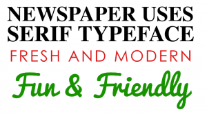
It’s worth bearing in mind that due to modern web technology like CSS3, we are no longer limited in our ‘web friendly’ font choices. Your font choice can portray emotion or feeling and connect with the right audience.
The other area to consider is your ‘kerning’. For those that haven’t heard of kerning, it is the spacing between each letter. Sometimes, it can look better a bit bunched up, for a logo maybe? Whereas spaced out lettering can give a modern or open look. If you’re unsure, ask an expert!


Conclusion
Quite frankly, I could make this blog 2 or 3 times longer with ease. I could show you examples and discuss various areas of our day-in-day-out lives where design affects our decision, but I’d bore you all. Take a look around; have a look at your office, or your kitchen, lounge or even your street. Design is everywhere, there is no getting away. Like the example I used in the first paragraph of finding a restaurant, there’s a lot that goes into successful business; reviews, visibility, price etc. However, if your E-commerce store isn’t taking design seriously, it needs to.
Our Create services can help with everything from your site’s layout, functionality and design to your branding. Get in touch now to find out more!